Home
Case study · Intuit TurboTax
TurboTax App Screens Test
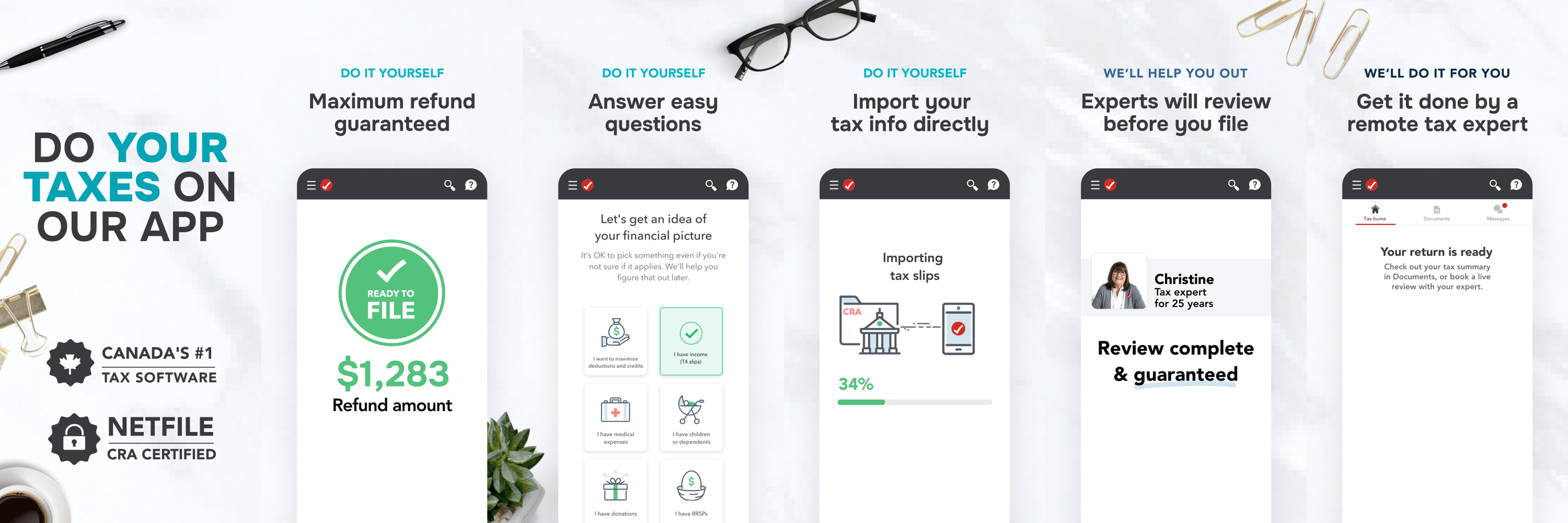
I owned the visual overhaul of our App Store presence, turning tax prep into an imagery-driven narrative with high-impact, billboard-style screenshots.
The Challenge
When browsing the App Store, users need to quickly find and understand an app's primary value proposition before making a decision.
The Strategy
We hypothesized that adopting a high-impact, billboard-style design for our App Store screenshots would improve readability and drive higher conversion. Bolder text and simplified UI previews would make core features instantly digestible.
My Execution
I owned the visual overhaul of our App Store presence. I audited our current screenshots and tackled the challenge of making tax preparation feel engaging and delightful, translating technical product features into an elegant, imagery-driven narrative.
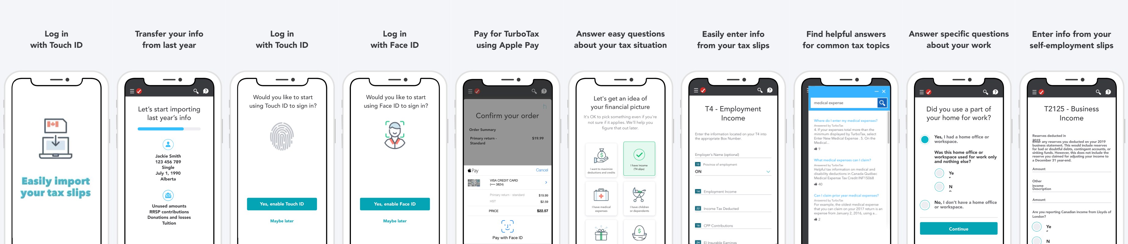
Old screens
- At a glance all screens look the same.
- Customer benefits and app features are mixed in the flow.
- Too many screens and information for mobile users with low attention span to remember.
- Visually monochromatic - doesn't stand out in search results.
Recipe #1 Conventional refresh
- Leveraging Intuit Design System color scheme
- Featuring a TurboTax happy customer
- Product UIs in focus / strong visuals
- Short and direct captions

Recipe #2 — Bold billboard
- Billboard style, one continuous image that entices customers to scroll
- Clean & fresh approach
- Product UI stands out (device agnostic)
- Never been done at Intuit scale TurboTax, QuickBooks or Mint