Home
Case study · Intuit TurboTax
TurboTax Live Homepage Test
A mobile-only A/B test for TurboTax Live on turbotax.ca — Control vs two recipes — built to raise desirability through storytelling and delightful interaction.
Hypothesis
If we increase TurboTax Live’s desirability on the homepage through storytelling and delightful interactions, engagement (CTR) will rise — because perceived trust shapes decision behaviour. Measured through a desirability study.
My role
It took a decade to get this concept past the GM because it was easily the boldest A/B test I built at TurboTax. Our goal was to change the narrative around traditional tax software and elevate TurboTax Live to a level customers wouldn't even think possible. Reaching the starting line required intense research, user feedback, and alignment across visual design, content, technology, and legal. Once we secured executive sign-off and ran the test, the results were astonishing. I led the overall layout design and section transitions, while managing a heavy dose of cross-functional pushback along the way.
Test notes
- TurboTax Live A/B test on turbotax.ca
- EN only — no French
- First-time visitors only (not returning customers)
- Mobile only
- Specific mobile devices and browsers at the time
- Customers who landed from specific SEO pages onto the homepage
Control
The live TurboTax Live baseline. Product-led homepage: Live Assist & Review and Full Service cards, expert photography, orange CTAs, and trust guarantees — optimized to match visitors into a Live SKU, not to tell a story.

Recipe A
The storytelling reimagine for TurboTax Live. Lead with the emotional payoff — “Get your biggest paycheque of the year” — then scroll through a narrative of refund, ease, and delight. This was the bold desirability bet: same Live destination, different feeling.

Recipe B
TurboTax Live Full Service, cinematic. Dark immersive scroll — “Taxes done entirely for you” — expert pairing, how-it-works, comparison, and proof. Built for visitors ready to hand taxes off to a Live expert, without the Control’s product-card grid.

Results
The storytelling variation won. Against Control, it raised conversion, concentrated clicks on the primary CTA, and pulled visitors dramatically deeper into the page — one of the strongest TurboTax Live homepage tests we ran.
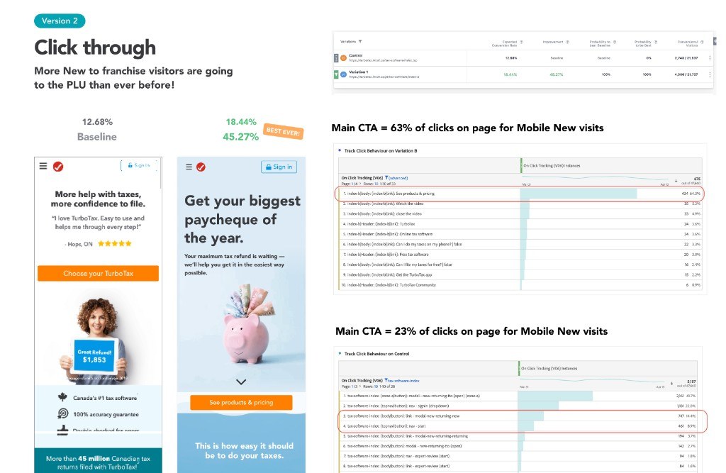
Click through
+45.27% conversion vs Control (12.68% → 18.44%). Main CTA took 63% of all clicks on the winning recipe vs 23% on Control — labeled best ever at the time.
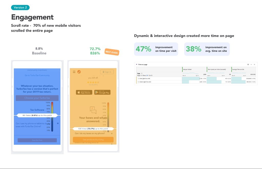
Engagement
70% of new mobile visitors scrolled the entire page. Deep-scroll reach jumped 8.8% → 72.7%. Time per visit +47%, average time on site +38% — dynamic, interactive storytelling held attention.